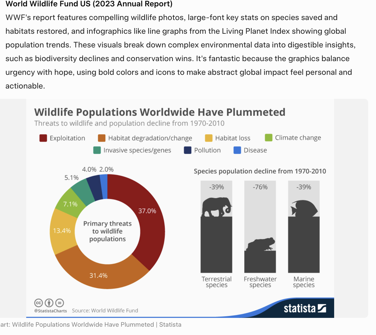
✅ Show Change Over Time (Before vs After)
Like your reading proficiency chart. Use curves or bars to show movement, not just static numbers.
✅ Compare Against Targets
Not just “78% improved” — show how that compares to a goal.
✅ Use Multiple Visual Types When Appropriate
Bar + line + funnel + heatmap can all coexist.
✅ Add Callouts and Narrative Labels
A legend alone isn’t enough — add text boxes that explain why changes matter.
✅ Make It Graphic-Rich, Not Spreadsheet-Like
White backgrounds, subtle gridlines, big text, bold lines.